I’ve been wanting to make some changes on the blog for the longest time now- and I finally did. It’s a constant desire of mine to spruce up my blog’s design and if I didn’t like my previous theme so much, I’d probably have gone through several looks already. I didn’t want to completely stray from my old design but knew I needed something sleeker and elegant.
And then came Ashley of Nose Graze’s beautifully updated Tweak Me Theme! Tweak Me v2 was exactly the kind of base theme I knew I wanted to model my knew look around- it’s so customizeable and responsive. Ashley is seriously a genius when it comes to coding and I can’t recommend her design services and products on Creative Whim enough.
All that gushing aside, I spent most of the day altering the theme to get the look I wanted. Since I had very few codes to modify (Tweak Me v2 pretty much does everything and allows all kinds of tweaks), I mostly had to just work on the design. Not everything is final, but as you can see, this updated look has a different feel than my previous one.
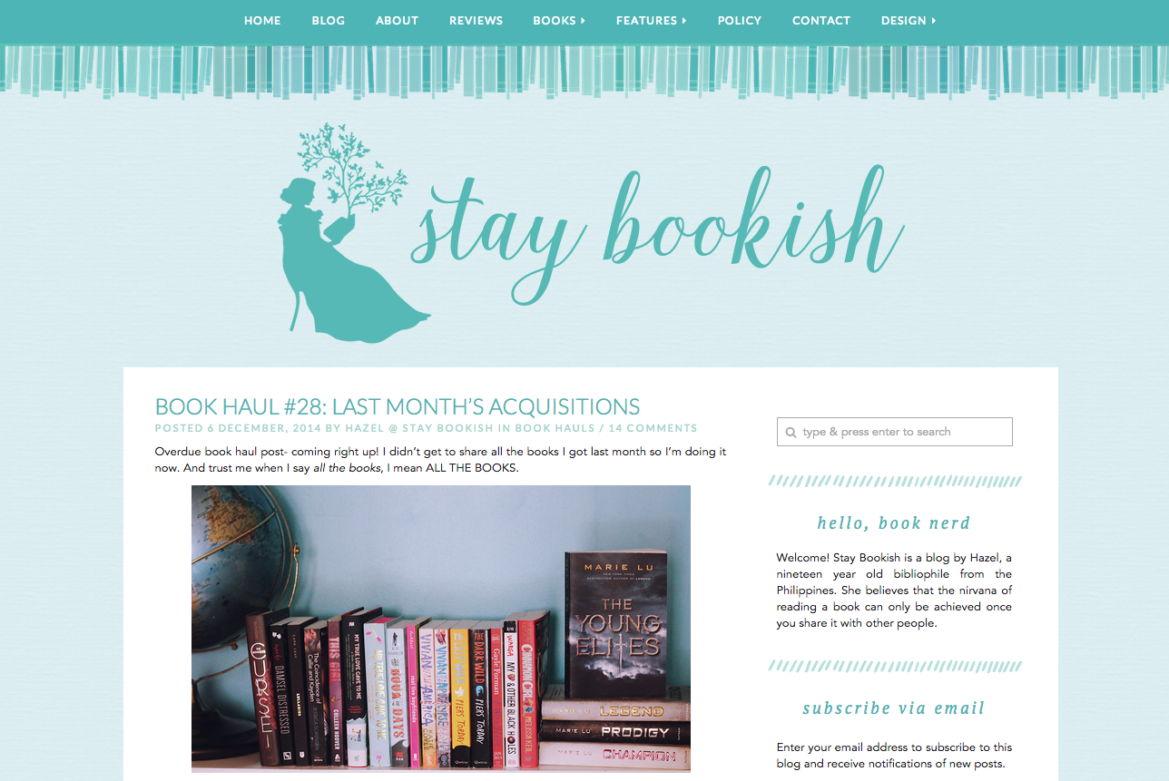
The Blog Archive
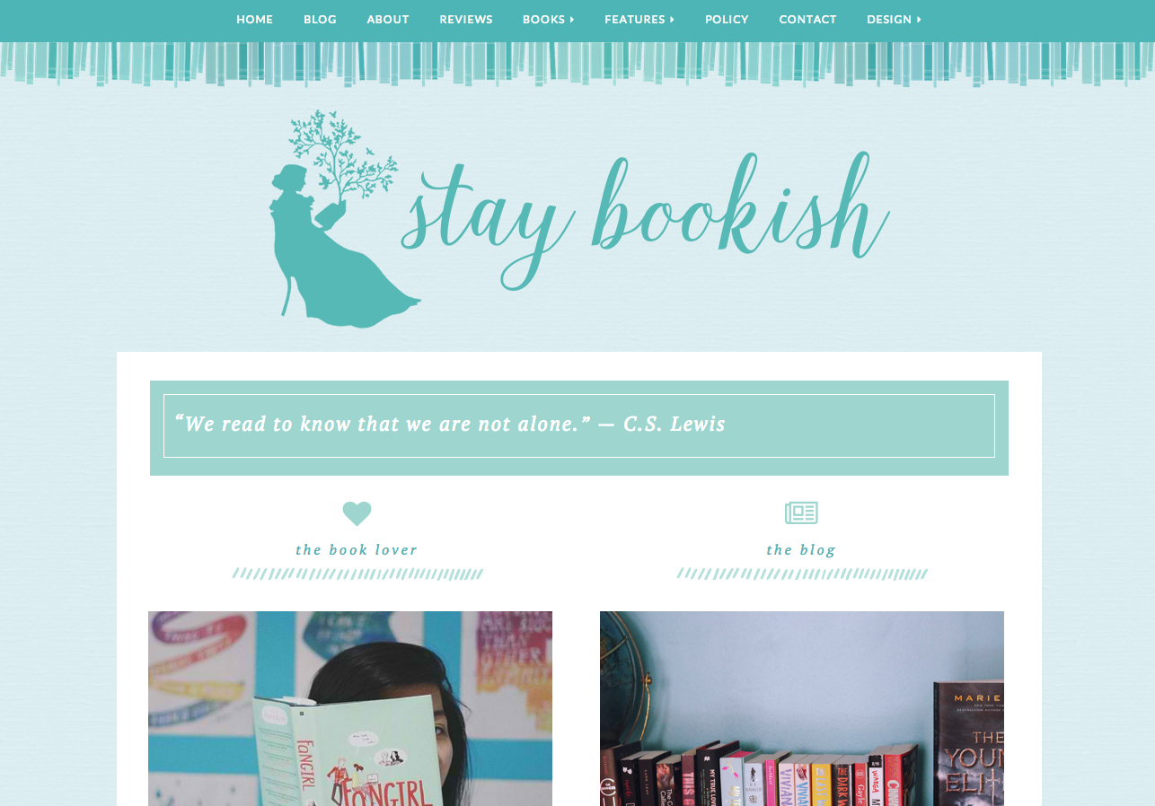
The Home Page
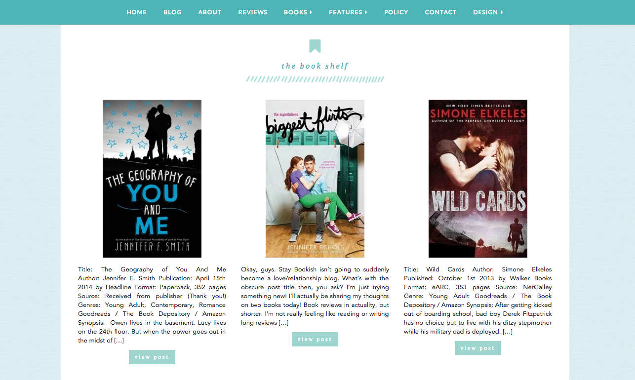
Home Page Section: Book Reviews
The minor changes include fonts, layout and styling mostly. The major change with this revamped look is that I now have a landing home page. It consists of widgets to redirect you to the rest of the blog’s content- kind of like an introduction to Stay Bookish. The blog archive is now on a separate page as well. So if you want to check out my log of recent posts, that’s where you’ll have to go.
I’m really happy with this change in design and I hope y’all like it too! Please let me know what you think of it in the comments below (suggestions are completely welcome) and if you find any glitches that need to be fixed! :)





22 Responses
Squeee!! You’ve done such a fantastic job customizing Tweak Me v2! I think it looks fantastic!!
<3333 THANK YOU, ASHLEY! I'm so happy with it and can't thank you enough for your wonderful theme! :DDD
The new design looks fabulous! You did an awesome job customizing it, Hazel! I loveeeeee the home page. It’s just so awesome and oh so pretty!
I totally understand about needing to spruce up your blog design. I have the urge, but I have no desire to stray away from my current design (since it’s so beautiful). I guess I need to change the little things first like the header and such. (Maybe.)
(My only suggestion is to make the post titles clickable. I’m a bit miffed that I can’t get to your posts that way.)
Thanks, Cee! <3333 Your site is already so beautiful but I get how you feel! Thanks for bringing up the titles! I think there's an error and I'm currently trying to figure out what needs to be fixed. :)
It looks AMAZING :D!
Thanks, Mel!!! :’)
Wow, the new design looks amazing!!! All these beautiful Tweak Me themes make me want to change to WordPress….
Thank you! :D The themes and ability to customize as much as you want is def a perk of self-hosted WP!
HAZEL THIS IS GORGEOUS!! I’m so envious of you! I honestly think your design is one of the prettiest that I have ever seen EVER. You have some serious talent! And of course, Ashley is a coding genius and all her themes are so nice and organized and sleek! Really lovely!
I love the new design, Hazel! It’s very clean and suits you very well :)
I’m very jealous, it’s gorgeous!!! The design reminds me of Effortlessly Reading’s design. :D
It looks so clean! I am so tempted to go and buy it myself, but I don’t have the money. :/ Maybe I’ll actually learn how to make a theme someday, though. But not anytime soon.
Ohhh this is awesome! I love how sleek and flat it is – very easy on the eyes :)
HELLOOOOO GORGEOUS!! :D as usual, beautiful work Hazel! I’m always so in awe with your work :3 this is no exception! What a looker!! xD
Everything looks incredible, Hazel! You are a brilliant designer and your themes show it :)
Wow. Just wow. You just upgraded your blog! I love how it really looks elegant; great job!
Oh my goodness, it’s absolutely beautiful! I love how it’s still so recognisably you, Hazel. It’s a completely new theme but it’s still the old one, too, and I loooooooove how clean and modern it is!
hmmm…i like the blue theme going on…it is elegant and romantic in style…it’s good you also archived your blog posts…although maybe you can outline with something dark like black perhaps to your blog name…at least to break off the too blue color scheme…well that’s just me :)
Wow, it looks FANTASTIC and beautiful!!! Congrats. :)
I love your redesign! It definitely looks very clean, which I like, and I love that it’s still recognizably YOUR blog.
I love your new design, Hazel! It’s gorgeous, and even though it still incorporates the color schemes and graphics from your old design, it’s got a noticeably different feel; almost like there’s more breathing room. Plus the fonts look lovely as well! Great job tweaking it, it looks great!
I love the new changes!