Hell yeah, Stay Bookish has a new feature! I have always loved book cover features- my favourites including A Reader of Fiction’s Cover Snark, Pop Goes The Reader’s Do! Judge A Book By Its Cover, What She Reads’ Cover Palette, The Novel Hermit’s Holy, Mother Cover!- and have always wanted to do one here on the blog too. So I came up with Cover Creatives.
As a design enthusiast, I want to focus on the creative aspect of book covers: the ideas, the process and the creative designers behind it. While I’ll do the usual ‘collective’ of book covers, I will also be having some wonderful book designers over for interviews, guest posts and such. Today, I’ll be kicking off this new feature with a Q&A with the one and only Regina Flath, along with all the beautiful covers she’s worked on! :)
Cover Creatives Interview: Regina Flath
Hi Regina! To start- how did you get into the book cover design business?
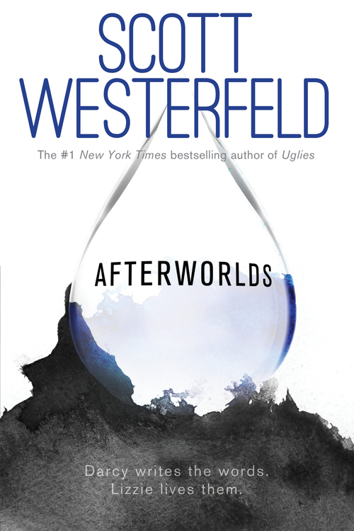
I went to the University of the Arts, Philadelphia, as an illustration major, originally intending to be a children’s book illustrator. As I went through the program and did projects where I placed my illustrations in context (ie, designed them into book covers and interiors) I fell in love with that process. Around my junior year I switched my focus from primarily illustration to primarily book design. One of my professors is married to an art director at another publishing house who very graciously let me interview her about her career. After speaking with her at length, I was decided: working in house as a book designer was what I needed to do. So for every illustration project I did at school, I did another design project to go along with it. I did my thesis project (4 pieces in a series for your target market) as book jackets. During our portfolio day I happened to meet an art director at Houghton Mifflin Harcourt who spoke to me and liked my work. I impressed upon her that while I was an illustrator, I saw myself as a designer and really wanted to work in-house. A few days later she called me in for an interview and just after graduation I started my first design job at Harcourt. From there, my career took off and now I’m working happily as Designer at Simon Pulse, an imprint of Simon and Schuster.
How would you describe your creative process?
When I get a project, the first thing I do is dip into the manuscript. I read 98% of the books I work on (but for a series paperback repack, for instance, I’ll read book 1 but probably not the other books in the series unless I get sucked in!). Reading the manuscript completely informs my design choices. From the tone of the story to the overarching themes to the visuals present in the plot, I pull on text heavily as I formulate my ideas. Depending on the book, the budget, and the schedule, I’ll approach my concepts in a couple different ways. Sometimes I’ll dive into one of my favorite stock agency sites and then start combing through with key words to try to find a compelling image that hits all the relevant points for me (tone, theme, visuals, as well as market considerations like what’s already out there/what would work on the shelf next to this book). Other times I’ll be struck with a specific concept that I want to execute and depending on the complexity I’ll either find stock and photoshop it together myself or I’ll hire a photographer and do a photo shoot. After I have imagery, I work on the typography to pull it all together.
Which book cover you’ve designed are you most proud of or is your favorite?
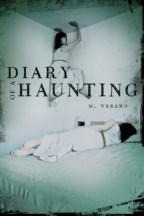
My favorite cover is always the most recent cover I finished! Right now it’s a tie between Diary of a Haunting (which is going to have OFF THE HOOK special effects like a printed case cover and a clear acetate jacket; I also made an animated gif of the cover so you can see the creepy effect the acetate will have on the print book when you check it out on the web!!) and Anne & Henry, which is my take on some of my favorite things: historical retelling and punk rock posters.

Have you experienced any challenges when it comes to designing book covers? What are they and how do you deal?
There are almost always challenges when designing covers. Any kind of commercial art requires pleasing a lot of audiences. For a book designer, that includes the design team internally, the editorial team, the marketing and sales team, the book buyers, the author, and hopefully the consumer. That’s a lot of people who have to agree on something that’s pretty subjective! Often that will be the biggest hurdle, making sure everyone is on board with a particular design. If not, I’ll have to go back to the drawing board, which happens pretty frequently. The good thing though, is that there is ALWAYS another idea. That’s the creative part of being a creative professional.
Where do you find inspiration for your designs?
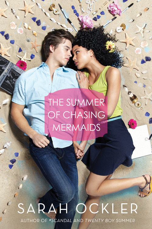
The short answer to this is everywhere. The fun answer to this is tumblr. To be honest, it depends on the book in question, where I’ll pull inspiration from. I’ve always been of the mindset that if you’re working as a creative professional, you have to be able to take your personal experiences from the world and combine that with what your source material is (books in my case) and cook that up in your brain to create interesting design. I mentioned the gif I made for Diary of a Haunting above. My love for gifs comes from haunting tumblr for funny gifs from movies or shows I like. Sometimes a silly tumblr post about whatever fanfiction I’m into currently will jog my brain into thinking about a romantic book cover I’m working on in a different way. I did a super fun cover shoot for a book called The Summer of Chasing Mermaids that was inspired by my love of a burlesque dancer here in NYC named Veronica Varlow. On the surface, the 2 have nothing to do with one another, but this dancer had a great portrait done with a bunch of stuff she likes surrounding her and I was able to translate that into the cover imagery for The Summer of Chasing Mermaids which is about a singer who loses her voice and uses things around her to communicate (and get involved in some romance!).
Which is more important for you when it comes to book covers- illustration/photography or typography?
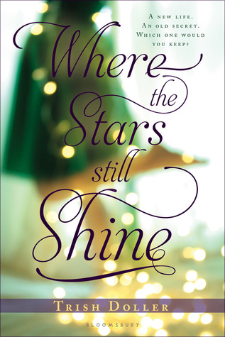
I think this depends on the cover (I say this a lot I guess!). If it’s a type driven cover, then for sure the typography is most important. If it’s a cover that’s a strong visual, then the imagery is most important. For any good design, there’s hierarchy. Something needs to have the most importance visually (whether type or imagery or whatever) in order to organize the image elegantly for your eye.
What do you think makes a great book cover?
A great book cover to me is one that invites you into the book, engaging the viewer by making him/her think, feel, or just plain get interested. Book covers don’t exist without the books they wrap around and that interplay of interesting and arresting design/imagery that works to entice a reader is what I hope to do with my work. There are a ton of designers I know that knock this out of the park! I totally have design envy/crushes on Lucy Ruth Cummins here at S&S, Erin Fitzsimmons at Harper, and Sara Wood, also at Harper (in the adult book team) who is a fellow UArts alumna! Those ladies do work that exemplifies what I think makes great cover design.

Thank you so much for imparting us your wisdom on book cover design, Regina! You rock! I look forward to seeing more of your designs on bookshelves. Book nerds, do check out more of Regina’s work on her website and give her a follow on Twitter!
What do y’all think about this new feature? What else do you want to see related to book covers & their designs? What do you think of Regina’s works? Leave some love!



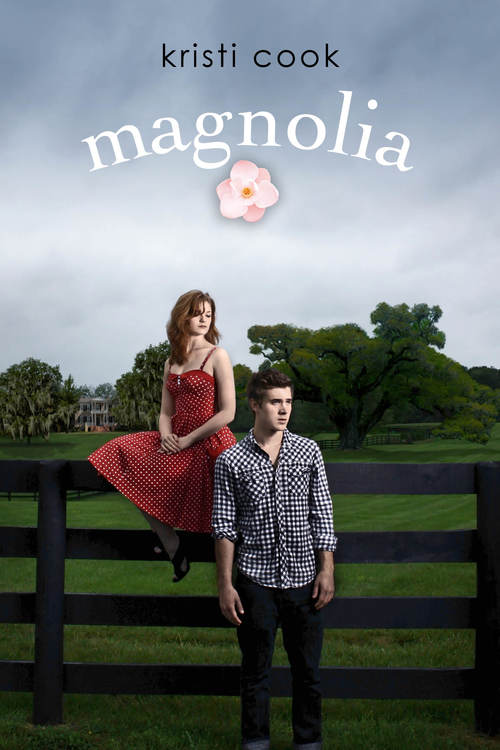
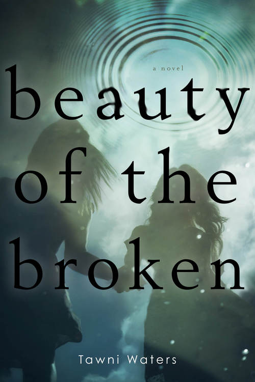





22 Responses
Whoa, Hazel! This is great! I love the Q & A but I absolutely adore Regina’s covers. Very nice feature. :)
Thanks, Joy! I’m so happy you like the new feature! Regina is pretty amazing, yes? ;)
Love the new feature!
Great interview; it’s not often you hear from cover designers, so I think this is great. Some great covers here! It’s been nice getting to know the creator behind them :)
Thanks, Rebecca! <3 I've always wanted to learn more about book cover designers! I was hoping my readers would feel the same so I'm absolutely glad to hear you enjoyed getting to know more about Regina! :D
Hazel, this is a great feature! I love it! I love seeing the people behind the covers, because it’s like every cover is your baby and project, it’s wonderful. Keep up the good work :)
I’m so glad you think so, Amanda! I completely agree! I believe cover designers need to get more credit for their wonderful works! :D
Yes! I love this feature already! I’ve always wondered who created the book covers we see in the shelves. Wow I did not know she created all these covers! I thought they were all done by different people. I really like Diary of a Haunting too! It’s so creepy how there’s a girl on the wall. Sort of reminds me of The Grudge.
Oh, you! <3 Thanks for the love, Leigh! All of Regina's covers have very distinctive styles and it sure is amazing how all these ideas came from one great mastermind. Diary of a Haunting's cover totally chills me!
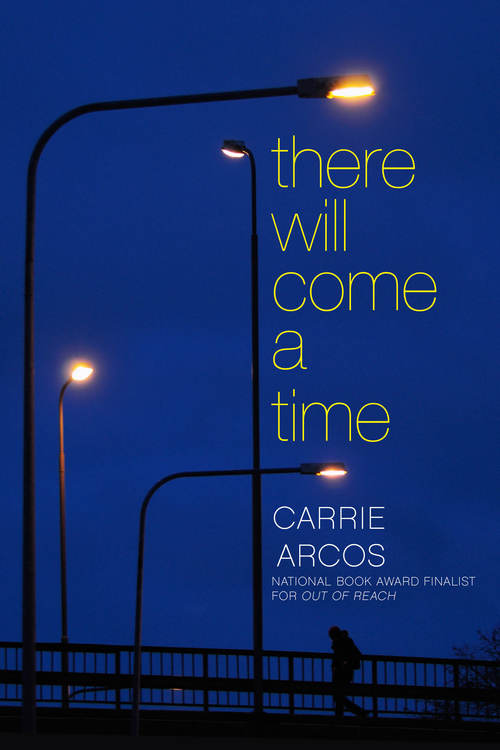
This is so awesome Hazel! I had a mini freakout when I saw There Will Come a Time – it’s one of my favorite books :D And I love the story behind The Summer of Chasing Mermaids; it makes me even more excited to read the book!
I seriously want to read There Will Come A Time soon! Aside from Regina’s great work on the cover, I’ve heard so much about how lovely the story is! I’m also so excited for The Summer of Chasing Mermaids!
wow! this is really a great feature…i rarely take a closer look at the artist behind the covers…but i do appreciate book covers and so thank you for blogging about what goes on in the process of making these kind of art works…i do think they play a huge part in conveying to the readers what the book is about. they are like gift wrappers you want to keep for life.
This is such a cool idea for a feature, Hazel–and such a great interview to kick it off! I recognize quite a few of these designs–in fact, I have a copy of AFTERWORLDS sitting right on my bookshelf–and it’s so great to get a chance to “meet” the artist who created them. Hearing about Regina’s process and career path was definitely cool, too. Thanks so much to you both for sharing!
What a great new feature. Thanks so much for giving us some insight. I can’t wait for the next post in that category :D
Oh wow!! She designed all of that?? Crazy good. Thanks for the awesome and insightful post :)
A good cover makes all the difference. I often will pick up a book just because the cover intrigues me even if I don’t know anything about the book! I love some of the covers she has designed!
Can I kiss you Hazel? I love everything about this feature! I love hearing how other people take on their design projects and seeing how their mind works when designing/photographing etc. Regina’s covers are pretty iconic, I recognised them as soon as I saw them :-).
This is such a fun feature, Hazel! I loved learning more about Regina and her work, and the pretty book covers you included definitely helped too ;)
OH MY GOD, HAZEL! What a great feature! And please send my love to that wonderful woman you interviewed. I just know she designed those lovelt book covers! They are freaking LOVELY AND COOL!! xx
Great interview—and Regina is a genius. She designed the PERFECT cover for Anne & Henry. I feel like I hit the cover jackpot :-)