Synopsis:
The last person seventeen-year-old Eleanor Livingston wants to see on the elevator—let alone get stuck with—is her ex-boyfriend Travis, the guy she’s been avoiding for five months.
Plagued with the belief that when she speaks the truth, bad things happen, Elly hasn’t told Trav anything. Not why she broke up with him and cut off all contact. Not what happened the day her father returned from his deployment to Afghanistan. And certainly not that she misses him and still thinks about him everyday.
But with nowhere to hide and Travis so close it hurts, Elly’s worried she won’t be able to contain her secrets for long. She’s terrified of finally revealing the truth, because she can’t bear to watch a tragedy befall the boy she still loves.
Thoughts on the cover:
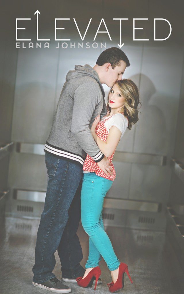
I love the typography! It’s neat, minimalistic, but really nice to look at! The photography is impressive too- the vignette gives the cover a mood. Like! :)
PS: I got the opportunity to read this one in advance and GUYS, it was so good! So much feels!
Expected release: February 18, 2014
Don’t forget to add Elevated to your goodreads shelves!
Giveaway:
a Rafflecopter giveaway
Author Bio:





6 Responses
I also like the minimalistic font. The guy kind of reminds me of that guy in How I Met Your Mother though. I cannot remember his name. :P
Yep, most covers now have really intricate fonts- it’s nice to see simpler ones! I don’t watch HIMYM much but are you possibly talking about Marshall? :)
The story sounds awesome, and OOOOHHHHH…. I LOVE that cover! Thanks for sharing, Hazel! <3
It is! If you want to try reading a YA Contemp Verse novel, this one’s a good start, Marci! :)
I actually really like the cover for this. For once we’re not bombarded with over the top muscle man and actually both models look realistic (if that makes sense). I love the colouring, if only the girl was wearing a purple top and it would’ve matched your layout Hazel!
Loving the font treatment, very stylist yet simple!
OH EM GEE OH EM GEE WOW why haven’t I heard of this one before???? Thanks for putting it on my radar!!